When it comes to branding, a logo is everything. Create a good one, and you have a recognizable icon for your company or organization that will be immediately identifiable. Fall short on the design, though, and you may be subjected to ridicule and derision—or worse, apathy.
It happens time and time again. Take fast-fashion company Zara's rebrand: Even though the brand's overall style remained the same, customers almost universally hated the new, tightly kerned logo. And that's just one example.
Other losing logos include Slack's controversial rebrand, the London 2012 Summer Olympics, Pepsi's less-than-successful redesign, and Sherwin-Williams' ominous “Cover the World” logo. Redesigns aren't only a PR move, either—they can be big business, with some of the most expensive ringing in at well over $1 million.
But enough with the negativity. What about those logos that are so brilliant you know them in a flash?
Stacker compiled the following list of 50 of the most famous logos of companies, corporations, and organizations for this slideshow quiz. As you click through each slide, see if you can correctly identify the logo. Getting a high score isn't just an accomplishment for you, though—it's also a sign that the graphic designers, advertising executives, and marketers behind these 50 icons did their jobs incredibly well.
Read on to find out how well you know your logos.
Mike Mozart / Flickr
Logo #1
Mike Mozart / Flickr
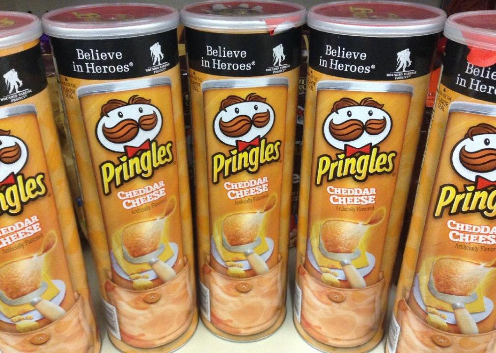
Pringles
Known for unique packaging and signature stacking, Pringles' logo features a cartoon gentleman known as Julius Pringle. Look closer at the word Pringles on the can, and you'll also see that the dot on top of the letter 'I' is actually a chip!
Delta Air Lines // Wikimedia Commons
Logo #2
TDelCoro // Flickr
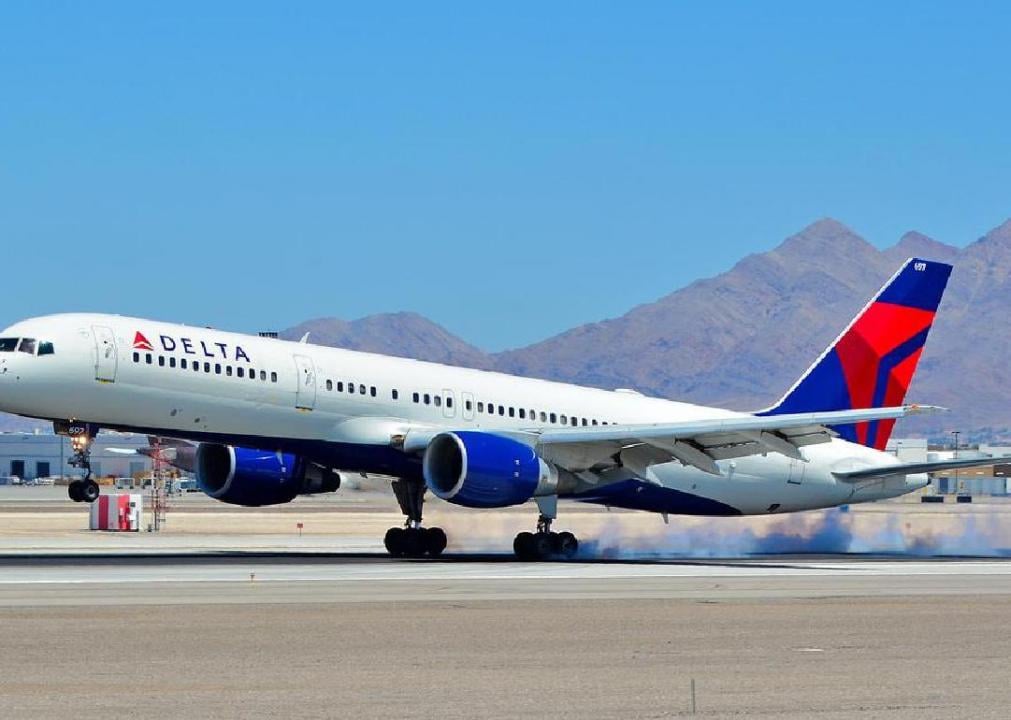
Delta Air Lines
Although Delta has gone through 20 iterations of its logo since the company was founded in 1928, they have all featured the triangular delta symbol. The brand's signature colours—blue and red—have also never changed.

John Deere (Deere & Company) // Wikimedia Commons
Logo #3

Tracy Keller// Flickr
John Deere
In 1876, John Deere filed a trademark on its leaping deer that has since become an iconic part of the company's logo. Customers might also be surprised to learn that the vibrant John Deere green wasn't used until 2000.
rauter25 // Flickr
Logo #4
ActuaLitté // Flickr
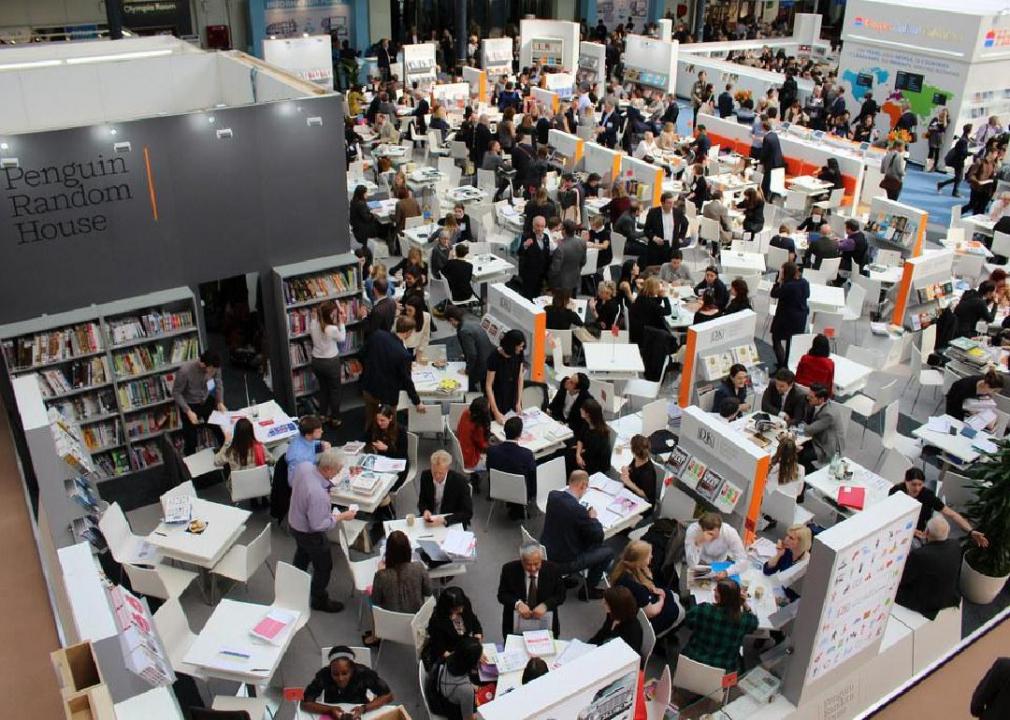
Penguin Random House
When Penguin Group and Random House merged in 2013, they fused their names into a sleek new typeface logo. Penguin's logo of its animal namesake and Random House's illustrated home are still in use, in addition to the new wordmark.
Pixabay
Logo #5
Pixabay
First created in 2006, the original Twitter bird looked slightly different than today's streamlined version. The company bought the original logo from British designer Simon Oxley for just $15.
Asics // Wikimedia Commons
Logo #6
planetc1 // Flickr
Asics
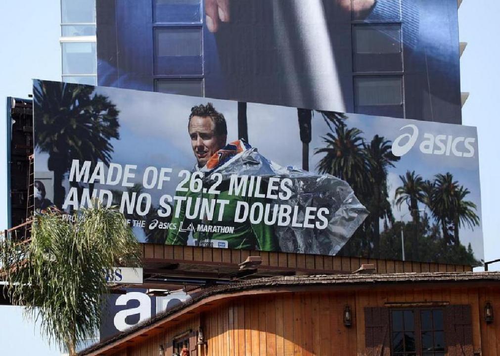
Asics was originally founded in 1949 by Kihachiro Onitsuka as ONITSUKA Shokai, but later changed the name to ASICS, which is an acronym for the Latin expression "anima sana in corpore sano" meaning “you should pray for a healthy mind in a healthy body." The roots of the present-day logo didn't appear until 1987, however.
PepsiCo // Wikimedia Commons
Logo #7
Håkan Dahlström // Flickr
Pepsi
The iconic Pepsi globe didn't appear on the company's logo until 1973, though the business itself dates back to the late 1800s. Since its debut, the circular logo went through several redesigns. In 2008, the company paid $1 million for the minimalist version we see today.
AT&T // Wikimedia Commons
Logo #8

JeepersMedia // Flickr
AT&T
For more than 100 years, AT&T adopted the logo of its parent company, Southwestern Bell. During a restructuring in 1983, AT&T created its recognizable globe logo—a version of that is still in use today.
DXR // Wikimedia Commons
Logo #9
JHVEPhoto // Shutterstock
Prudential
The Rock of Gibraltar has been Prudential's symbol since 1885. Even after all these years, the company still uses the rock on its logo to project strength and security to its customers.
WarnerMedia // Wikimedia Commons
Logo #10
Pixabay
Warner Brothers
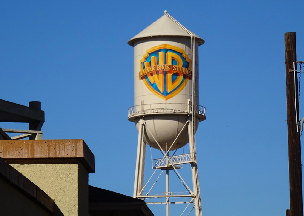
The Warner Bros. logo has more variation than almost any other brand logo, partially because the company actually encourages filmmakers to tweak its style to fit each individual movie. The basic design—the company's initials on a floating shield—appear in the vast majority of the logos, although Warner Bros. did use a stylized white W on a black shield with a red background for a short time in the 1970s.
Walmart Stores, Inc. // WIkimedia Commons
Logo #11
JeepersMedia // Flickr
Walmart
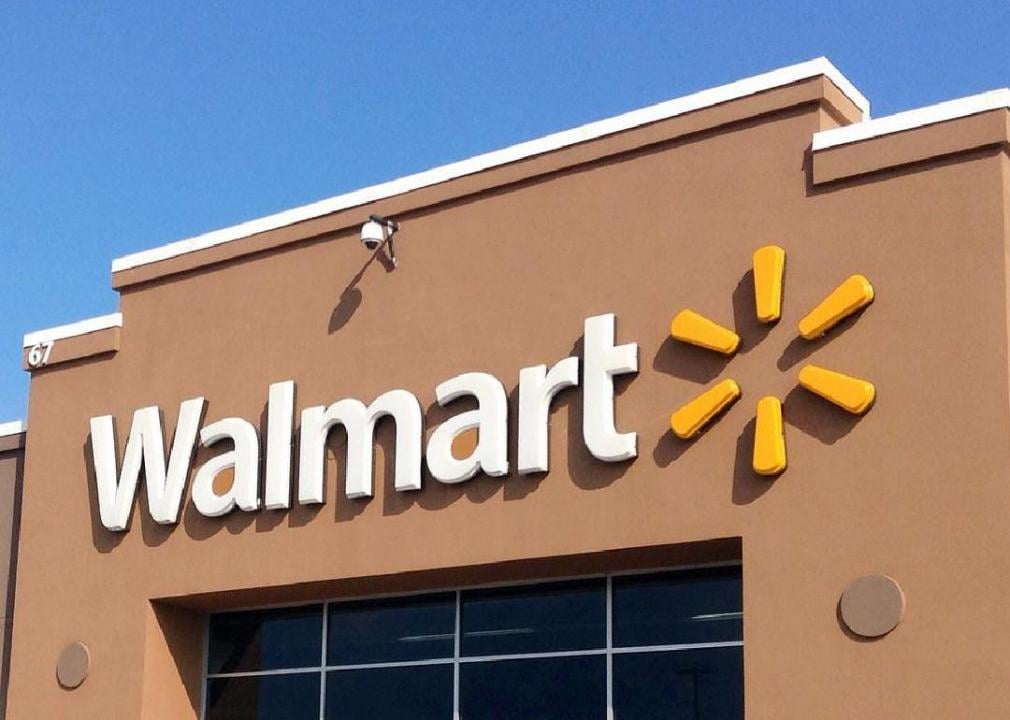
Founded by Sam Walton in Rogers, Ark., in 1962, Walmart has since become one of the largest retailers in the world. The logo has gone through several changes over the decades, from an old-time, Western-themed font to brown block letters to today's blue and yellow signage.
Equipe unilever volei // Wikimedia Commons
Logo #12
Judgefloro // Flickr
Unilever
With so many brands in its universe, Unilever needed a logo that would represent them all equally, from Lipton to Dove. Look closely at the U, and you'll see icons like an ice cream cone, lips, a fish, and laundry.

Nestlé // Wikimedia Commons
Logo #13
Dan Nguyen // Flickr
Nestlé
The Nestlé logo might seem a little odd at first—what does a bird in a nest have to do with their products? It actually comes from Swiss founder Henri Nestlé's family coat of arms. His family name means “little nest” in German, after all.
Pixabay
Logo #14
Zach Meaney // Unsplash
Guinness
Although it was founded when Arthur Guinness signed a 9,000-year lease on the Dublin brewery in 1759, Guinness didn't adopt its trademark harp symbol until nearly 100 years later.
Mike Mozart // Flickr
Logo #15
JeepersMedia // Flickr
Bank of America
The stylized American flag logo that has come to represent Bank of America first appeared in 1998 when NationsBank and BankAmerica merged to become the biggest bank in the country. The bank refreshed the typography of the logo in 2018, but it has otherwise remained the same.
Kazuhiro Keino // Flickr
Logo #16
Pixabay
Chanel
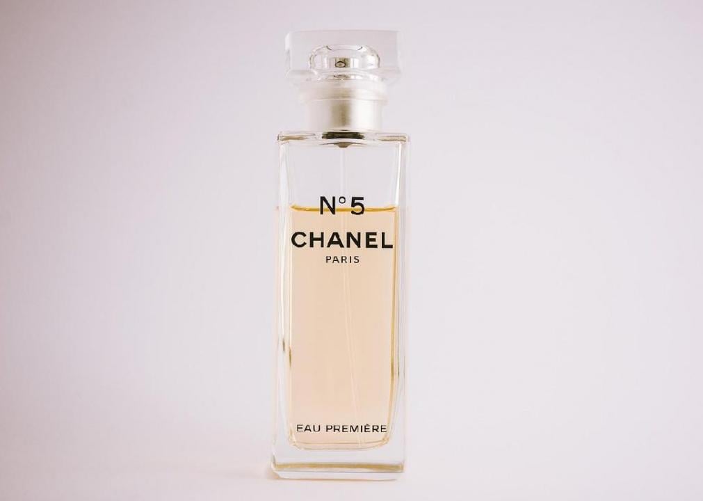
Coco Chanel became inspired to create Chanel's iconic interlocking C logo when she visited the Chateau de Cremat in Nice, France. It adorns everything from the brand's handbags to earrings to clothing.
Goodyear Tire and Rubber Company // WIkimedia Commons
Logo #17

NeONBRAND // Unsplash
Goodyear
The Greek god Mercury—a messenger known for his speed and carrying good news—was the inspiration for Goodyear's logo. Founder Frank Seiberling got the idea from a statue of Mercury that stood in his home.
Sinclair Oil
Logo #18
An Errant Knight // Wikimedia Commons
Sinclair Oil
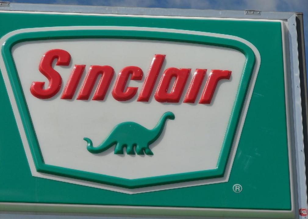
The idea to use dinosaurs as the branding for Sinclair Oil was born in 1930, when marketers were creating campaigns to promote lubricants refined from crude oil—thought to have formed before dinosaurs went extinct. The one dinosaur that captured America’s heart was the apatosaurus which prevails as the star of Sinclair’s logo today. Pixar has parodied Sinclair’s brand by using a dinosaur for the logo of its fictional gas station, Dinoco, in movies including “Toy Story” and “Cars.”

Wikimedia Foundation, Inc. // Wikimedia Commons
Logo #19
Casimiro PT // Shutterstock
Wikipedia
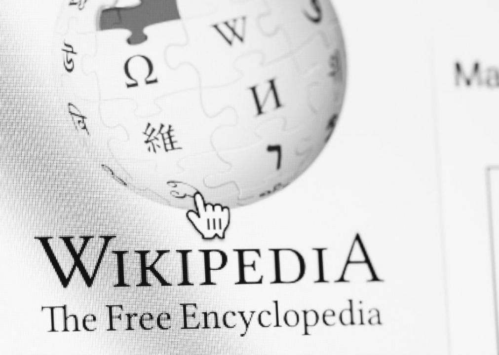
Wikipedia's logo—an unfinished jigsaw puzzle shaped like a globe with characters from several languages on the pieces—actually has a few errors in it. Though Wikipedia knows about the errors, it has chosen not to correct them: After all, it's fitting that the logo for the open-source online encyclopedia would sometimes have inaccuracies.
Foster's // Wikimedia Commons
Logo #20
Pixabay
Foster's
Though Foster's Lager is an Australian brand, it is actually brewed in the U.K. and is much more popular there than in its home country. Still, the 2014 redesign of the can added a crest and reinforced the beer's ties to Melbourne.
Target Corporation // WIkimedia Commons
Logo #21
JeepersMedia // Flickr
Target
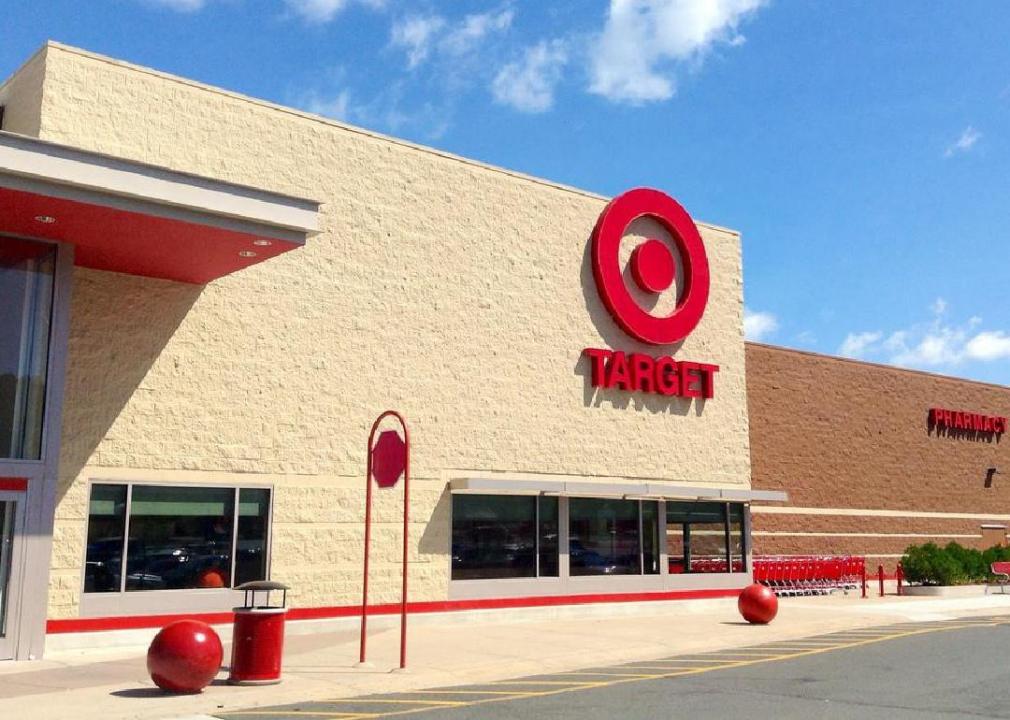
It's not surprising that a company named Target chose a bullseye for its logo. Target first adopted the bullseye in 1962, and today, 96% of Americans know what it represents.
General Electric Company // Wikimedia Commons
Logo #22
Momoneymoproblemz // Wikimedia Commons
General Electric
General Electric gets its knack for invention from its founder, Thomas Edison, who invented both the incandescent light bulb and the electrical grid. The scripted GE letters in the logo date back to the 1890s, although they've been streamlined a bit over the years.
Todd Wickersty // Flickr
Logo #23
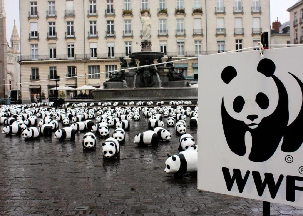
DocChewbacca // Flickr
World Wildlife Fund
The World Wildlife Fund has featured a giant panda on its logo since its founding in 1961. And it's not just any panda: The founders were inspired in particular by Chi-Chi, a panda living at the London Zoo.
Oblic // Wikimedia Commons
Logo #24
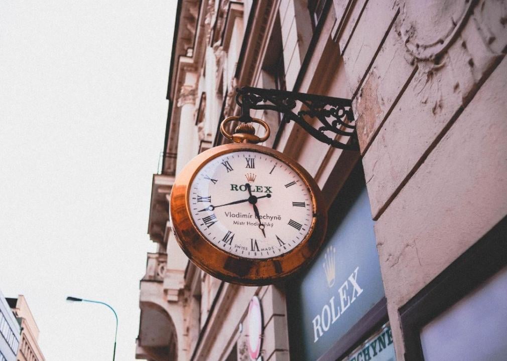
Anastasia Dulgier // Unsplash
Rolex
Founder Hans Waldorf didn't get the name Rolex from his family, ancient history, or any other source—he made it up. Waldorf knew that he needed a short, snappy name that the public would easily remember and said, “a genie whispered Rolex in my ear” while riding in a horse-drawn omnibus in London.
Boeing // Wikimedia Commons
Logo #25
wesleynitsckie // Flickr
Boeing
The world's largest aerospace company, Boeing produces everything from the commercial airplanes you might fly on to vacation to communications aircraft that go into space. Its history dates back to 1916 when timber merchant William E. Boeing developed a single-engine, two-seat seaplane.
CoolKid1993 // Wikimedia Commons
Logo #26
JeepersMedia // Flickr
General Mills
In 2017, General Mills added a red cartoon heart to its signature cursive G to symbolize that it produces food people love. It's the sixth logo change in the company's 91-year history.
Internet Archive Book Images // Flickr
Logo #27
legacy1995 // Shutterstock
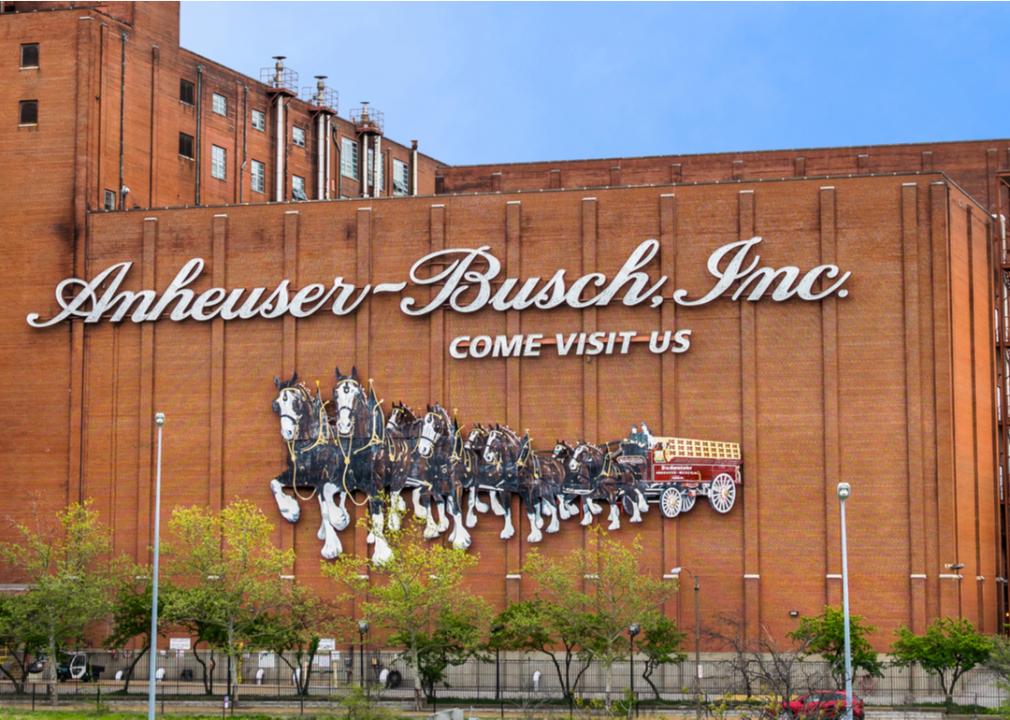
Anheuser-Busch
This massive beer producer is named after its two founders, Eberhard Anheuser and Adolphus Busch, who owned a German-style brewery in St. Louis together in the late 1800s. One of their first beers was an American-style lager named Budweiser to appeal to German immigrants.
pxhere
Logo #28
Pixabay
Michelin
You probably recognize the unusual figure on the Michelin logo: the jolly Michelin Man made out of tires. What you might not realize is that he has another name—Bibendum—which founder Andre Michelin borrowed from a poster drawn for a Munich brewery.
Wikimedia Commons
Logo #29
LoopZilla// Flickr
Thomson Reuters
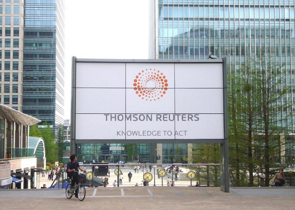
Paul Julius Reuter founded the company that would one day become Thomson Reuters in London in the 1850s. He used the telegraph and a 200-strong fleet of carrier pigeons to transmit stock market information and news at an impressively fast pace, establishing the brand's long-standing reputation for accuracy and speed.

Toyota // Wikimedia Commons
Logo #30
Joe Ross // Wikimedia Commons
Toyota
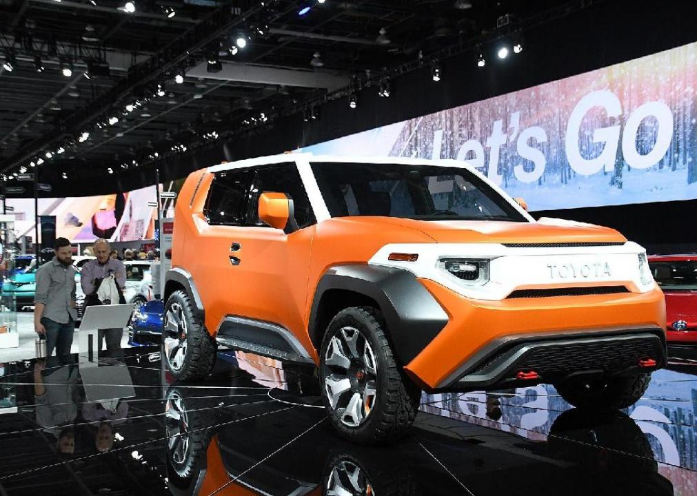
Originally named Toyoda after its founder's family name, Toyota's first emblems used wings to convey the cars' speed and an iconic symbol of the Japanese city of Nagoya to represent its origin city.
Volkswagen // Wikimedia Commons
Logo #31
cogdogblog // Flickr
Volkswagen
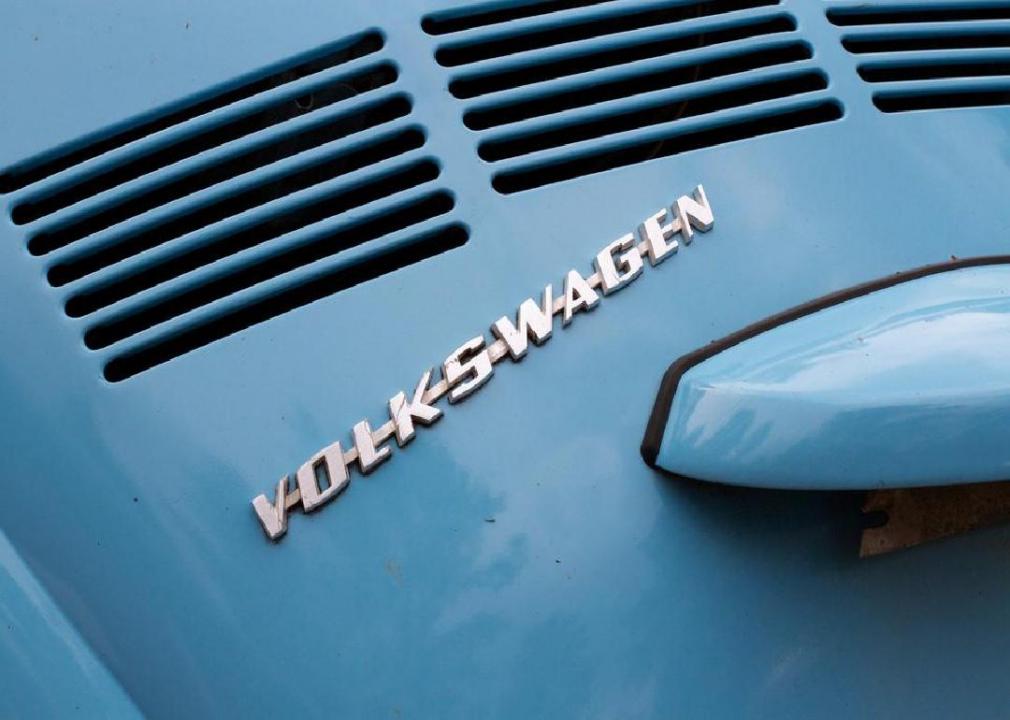
Though it has since been denationalized, Volkswagen was originally founded by the German government as a way to provide affordable, low-priced cars to the masses. The company's name means “people's car” in German.
William Golden/Estoy Aquí // Wikimedia Commons
Logo #32
marko8904// Flickr
CBS
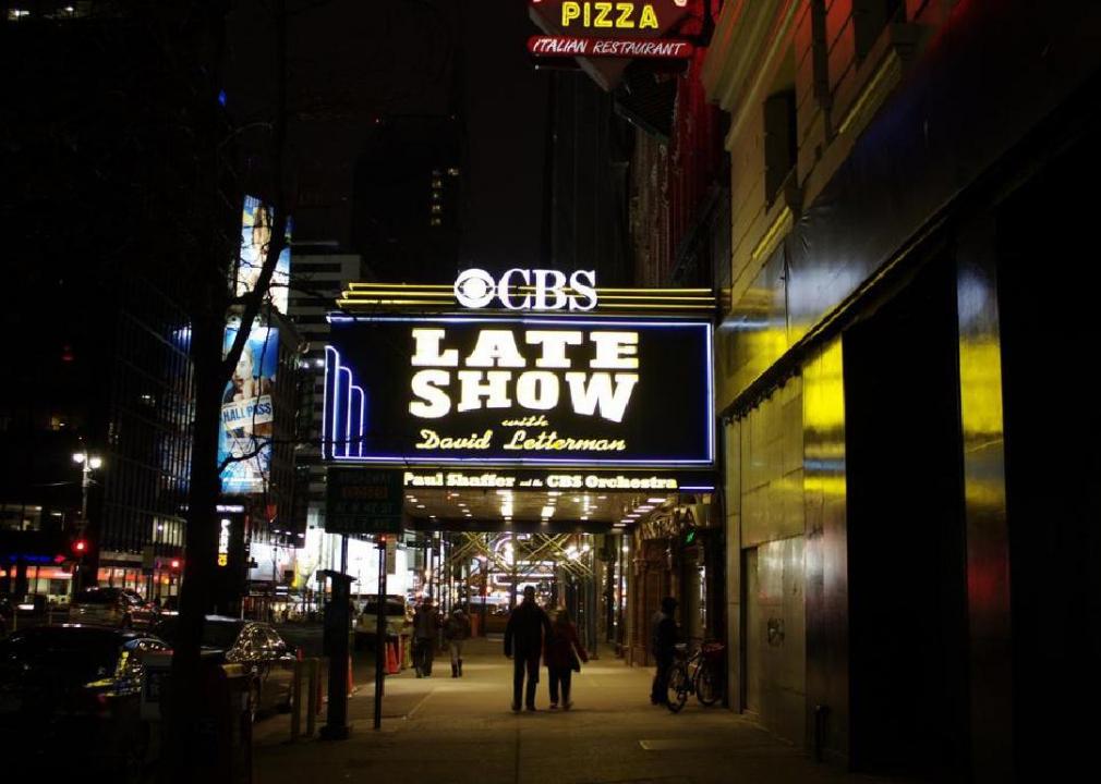
CBS creative director Bill Golden got his inspiration for the eye on the CBS logo when he was driving through Pennsylvania Dutch Country in 1951. After seeing the hex symbols meant to ward off evil on barns, he found the eye that would become a national symbol for the network in a Shaker art book.
Frederik Hermann // Wikimedia Commons
Logo #33
Ashley Pomeroy // Wikimedia Commons
Toblerone
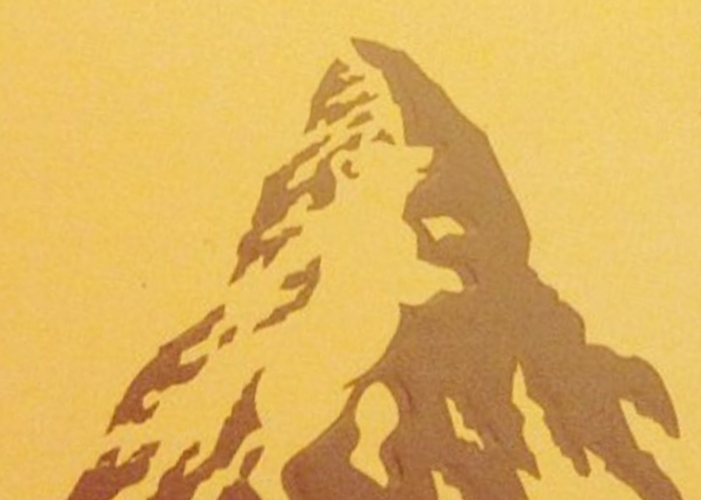
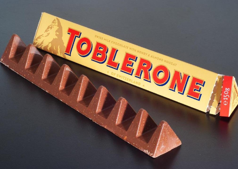
Toblerone had a viral moment recently when fans discovered that if you look closely, you can spot a hidden image in the mountain on the logo: a white bear. The image of the bear is a nod to the town of Bern, Switzerland—the birthplace of the candy.
Carolyn Davidson // Wikimedia Commons
Logo #34
REVOLT // Unsplash
Nike
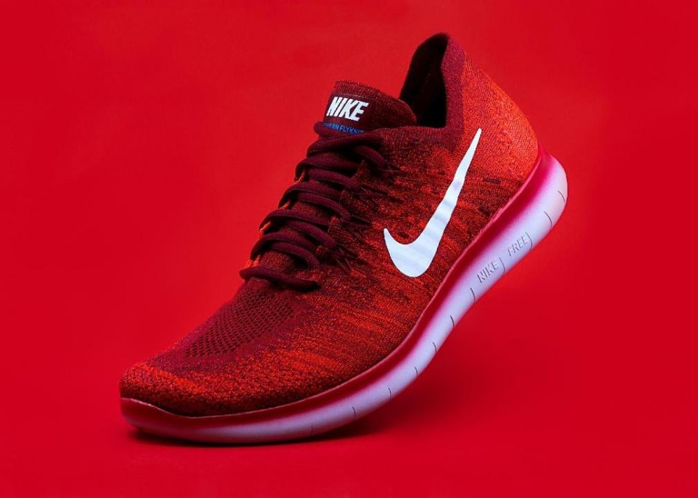
The Nike swoosh has truly become iconic. The company's first employee, Jeff Johnson, came up with the name, which comes from the Greek goddess of victory.
Mike Mozart // Flickr
Logo #35
Mike Mozart // Flickr
Quaker Oats
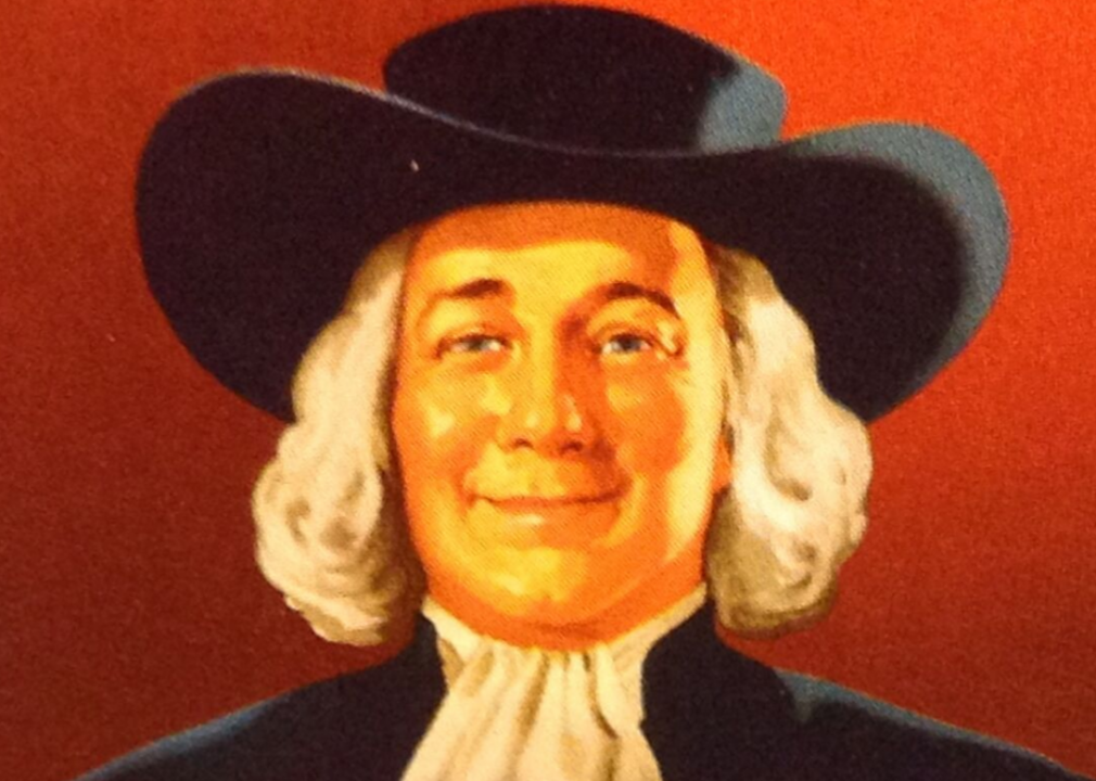
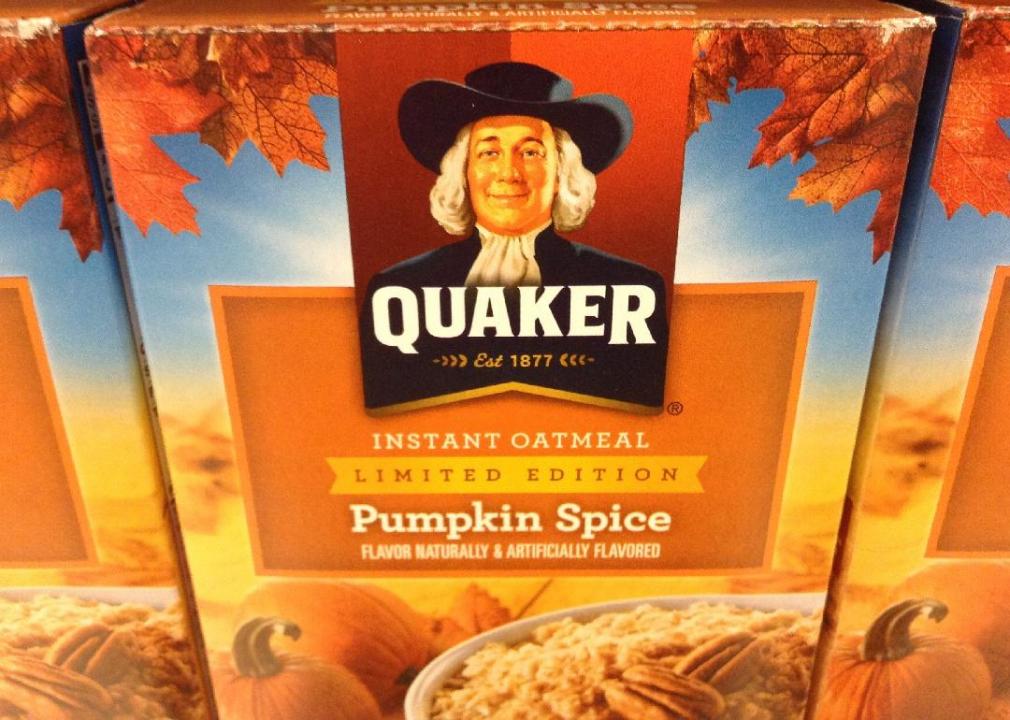
The so-called Quaker Man has appeared on the Quaker Oats logo since 1877, but that's not to say he hasn't received a few makeovers through the years. In 2012 the company gave him a two-toned background and appeared to thin out his face.
Wikimedia Commons
Logo #36
Pixabay
Spotify
The Spotify logo has included some form of sound bars since the company's founding, but it became more sleek and streamlined in 2013. The streaming service's bright green colour has remained the same, though.
Goodwill Industries // Wikimedia Commons
Logo #37
Mike Mozart // Flickr
Goodwill
In 2018, Goodwill's “smiling G” logo turned 50. Depending on how you look at it, you can find two different images: either half of a smiling cartoon face or a block letter G on a blue background.
Hilton Hotels & Resorts // Wikimedia Commons
Logo #38

Wem43 // Wikimedia Commons
Hilton
When Conrad Hilton bought the Mobley Hotel in Cisco, Texas, in 1919, he laid the foundation for a global hotel empire. Today, Hilton boasts more than 5,200 hotels around the world.
Red Bull // Wikimedia Commons
Logo #39
EKSRX // Wikimedia Commons
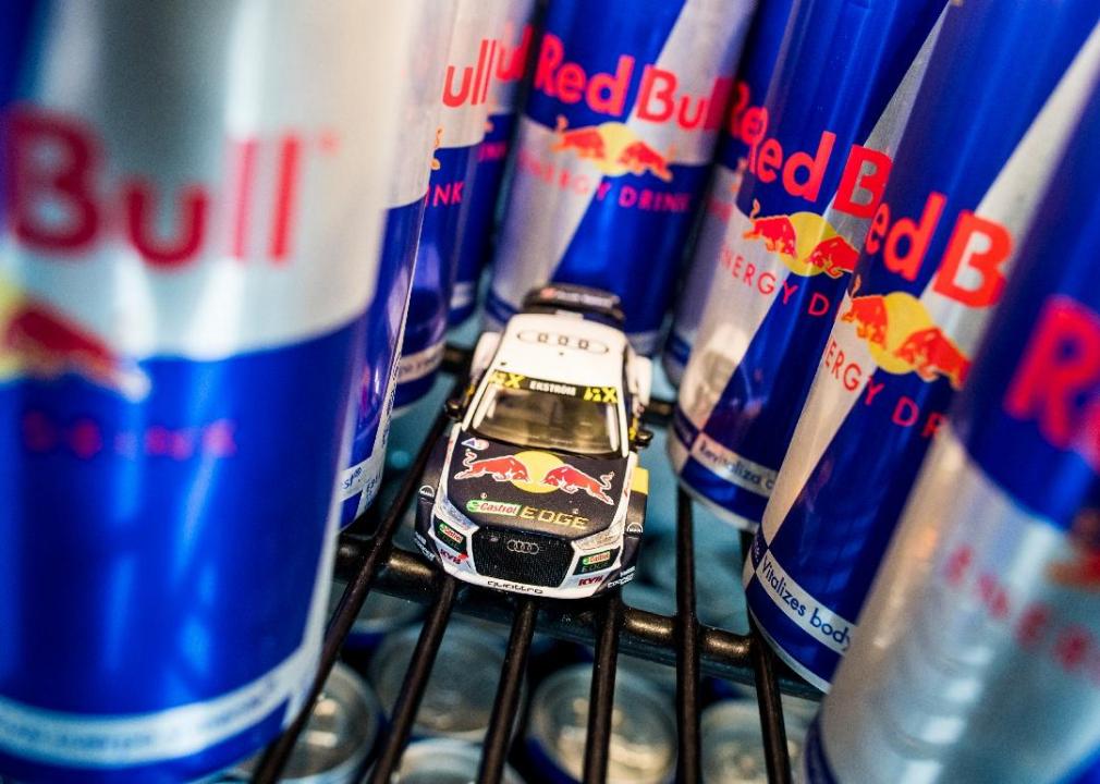
Red Bull
As one of the first energy drinks to hit the market, Red Bull needed a flashy logo to make its mark in a new category. The first ad depicted a red bull with a polka dot tie holding a tray of Red Bull, and the caption said the drink was “so awesome that polka dots will literally fly off your tie.”
Allstate // Wikimedia Commons
Logo #40
JeepersMedia // Flickr
Allstate
This insurance company's logo is a visual depiction of its slogan: “you're in good hands.” Founded by Sears president and chairman Gen. Robert E. Wood in 1931. Allstate has since become the nation's largest publicly held personal lines insurer.
United Airlines // Wikimedia Commons
Logo #41
InSapphoWeTrust// Flickr
United Airlines
When United Airlines and Continental Airlines merged in 2010, United adopted the blue branding and globe logo of Continental. Before the merger, United's logo featured a stylized icon meant to look like the tail of the plane in red, blue, and orange.
Jason Cipriani // Flickr
Logo #42
c0t0d0s0 // Flickr
Starbucks
A topless mermaid might not seem like a natural mascot for a coffee brand, but it has worked well for Starbucks ever since the first store opened its doors in Seattle in 1971. CEO Howard Schultz said the original mermaid on the logo came from a 16th-century Norse woodcut of a two-tailed mermaid.
Mastercard Incorporated // Wikimedia Commons
Logo #43
Pixabay
Mastercard
Mastercard's logo has featured one red and one gold circle since 1968 when the company was known as Master Charge. Today, the circles look a little more minimal and modern, but the underlying idea remains the same.

Pixabay
Logo #44

Rex Roof// Flickr
Playboy
In 1953, the iconic Playboy logo was designed in just 10 minutes by the company's first art director, Art Paul. The Playboy bunny appeared on cufflinks in 1955 and soon appeared on many more pieces of merchandise.
Liberty Media // Wikimedia Commons
Logo #45
Jure Makovec // Shutterstock
Formula One
In 2017, Formula One rebranded to a futuristic FI logo made of flowing, streamlined strokes. The prior logo—the original “flying one” logo that showed the “one” seemingly blowing away in the wind—had been in place for 23 years.
Baskin-Robbins // Wikimedia Commons
Logo #46
Pixabay
Baskin Robbins
The very first Baskin Robbins logo appeared in 1953. It featured the number 31 to represent a different flavour for every day of the month, pink and brown polka dots to evoke the flavours of cherry and chocolate, and the same bright blue background that you see on the logo today.
Louis Vuitton // Wikimedia Commons
Logo #47
achimh // Flickr
Louis Vuitton
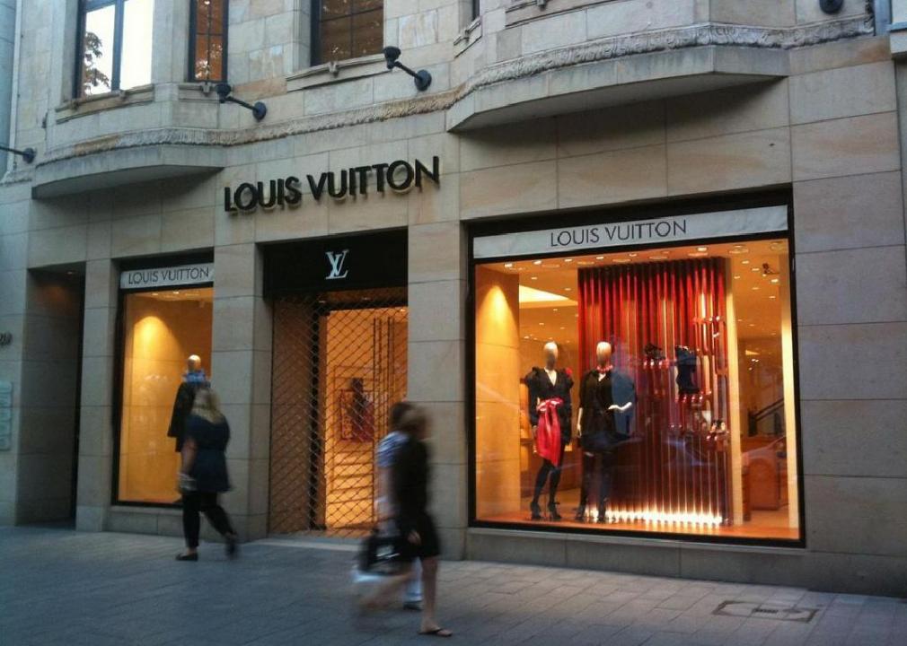
In 1854, Louis Vuitton set up his now famous luggage business in Paris. Even then, his bags were a status symbol; the waterproof trunks meant that your items were safe while travelling. The LV monogram pattern first appeared in 1896.

Expedia.com // Wikimedia Commons
Logo #48
SJByles // Flickr
Expedia
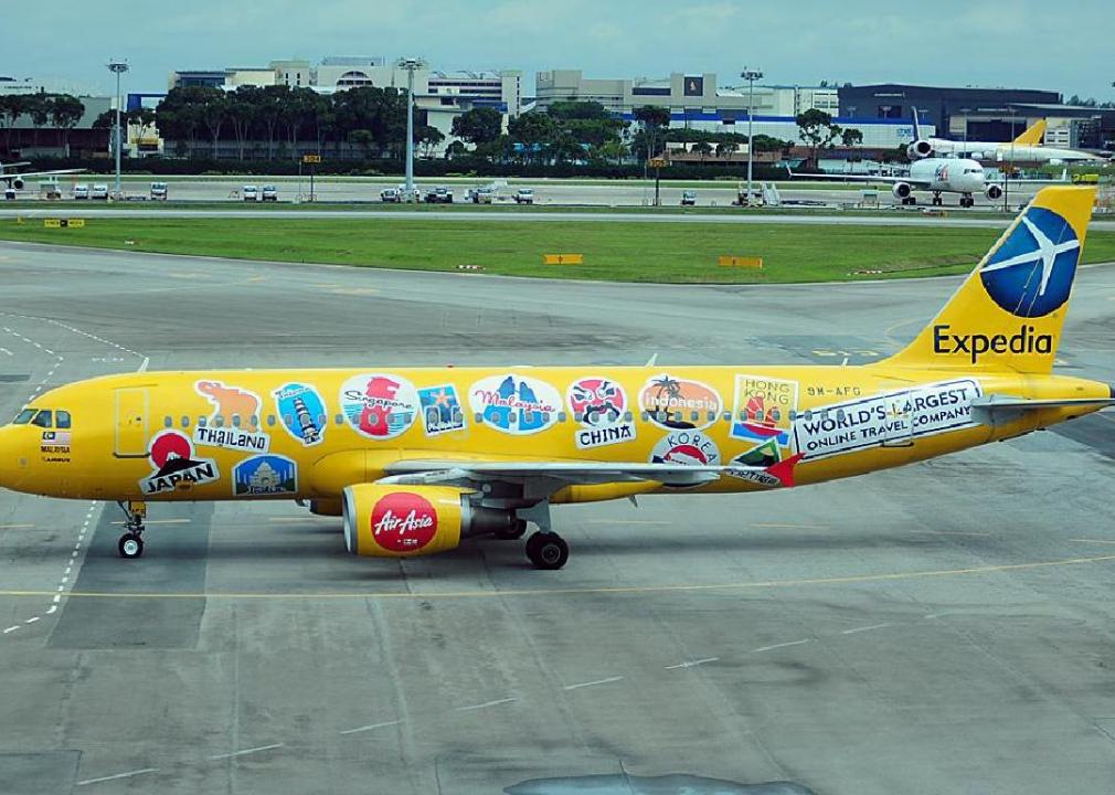
Travel booking platform Expedia's first logo incorporated a plane flying around a simple blue globe to symbolize the company's mission. Today, it's now known as Expedia Group and uses a simple E on a cobalt blue background as its logo.
Wikimedia Commons
Logo #49
Coolcaesar // Wikimedia Commons
Safeway
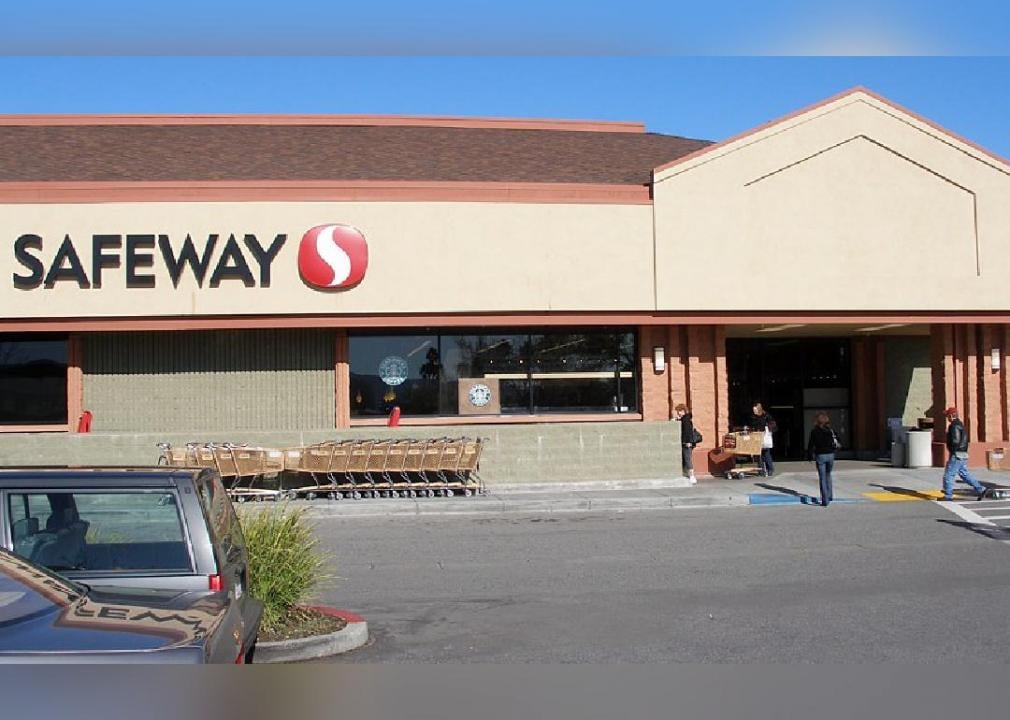
This leading U.S. supermarket chain has roots in American Falls, Idaho, where founder S.M. Skaggs opened his first grocery store in 1915. In 1926, Skaggs bought the Safeway brand and 332 stores from Sam Seelig, and the chain was born.
United Nations // Wikimedia Commons
Logo #50

Iudexvivorum // Wikimedia Commons
UNICEF
The globe on UNICEF's logo symbolizes the organization's work on behalf of children around the world: Today, it operates programs in 192 countries. The U.N. established this organization in 1946 to take care of children in postwar regions like Europe and China. The organization's mission has since expanded to address the needs of children and women in developing countries.

